Interpreting the Model Results
Interpretation
From the Fit! and Summary functions in previous section, we end up with two tables summarizing the mean estimates for the regression coefficients for the edge effects (out.edge_coef) and the posterior probabilities that nodes are influential (out.prob_nodes):
julia> out.edge_coef
465×5 DataFrame
 Row │ node1  node2  estimate  lower_bound  upper_bound
     │ Int64  Int64  Float64   Float64      Float64
─────┼──────────────────────────────────────────────────
   1 │     1      1     2.677       -0.753        5.392
   2 │     1      2     2.573       -1.27         4.881
   3 │     1      3     2.106        0.207        3.876
  ⋮  │   ⋮      ⋮       ⋮           ⋮            ⋮
 463 │    29     29     9.074        5.199       13.233
 464 │    29     30     3.015       -1.028        7.793
 465 │    30     30     1.262       -1.334        4.296
                                        459 rows omitted

julia> out.prob_nodes
30×1 DataFrame
 Row │ probability
     │ Float64
─────┼─────────────
   1 │        1.0
   2 │        1.0
   3 │        1.0
  ⋮  │      ⋮
  28 │        1.0
  29 │        1.0
  30 │        1.0
    24 rows omitted
Plot
The following R code can be used to plot the credible intervals of the edge regression coefficients.
First, we pass the data frame to R:
edges = out.edge_coef

using RCall
@rput edges
An alternative path is to save the data frame to file with CSV.write("edges.csv",out.edge_coef) and then read in R.
In R, we type
library(ggplot2)
library(tidyr)
nn <- length(edges$node1)
edges$edge <- 1:nn
edges <- transform(edges,rej=ifelse(lower_bound > 0 | upper_bound < 0,TRUE,FALSE))

plt <- edges %>% ggplot() + geom_errorbar(aes(x=factor(edge),ymin=lower_bound,
                                                                ymax=upper_bound,
                                                                color=rej)) +
        xlab("") + ylab("")+ ggtitle("95% Credible intervals for edge effects")+
        scale_color_manual(values=c("#82AFBC","#0E4B87")) +
        theme(
            plot.title = element_text(hjust=0.5, size=rel(2)),
            axis.title.x = element_text(size=rel(1.2)),
            axis.title.y = element_text(size=rel(1.9), angle=90, vjust=0.5, hjust=0.5),
            axis.text.x = element_text(colour="grey", size=rel(1.8), hjust=.5, vjust=.5, face="plain"),
            axis.ticks.y = element_blank(),
            panel.background = element_rect(fill = NA, color = "black"),
            axis.line = element_line(colour = "grey"),
            strip.text = element_text(size = rel(1.5)),
            legend.position = "none"
        ) +
        coord_flip() + scale_x_discrete(labels=NULL,expand=expansion(add=4)) +
        geom_point(aes(x=factor(edge),y=estimate, color=rej),shape=18, size=2) +
        geom_hline(aes(yintercept=0),linetype="solid",color="#696969", size=1)
plt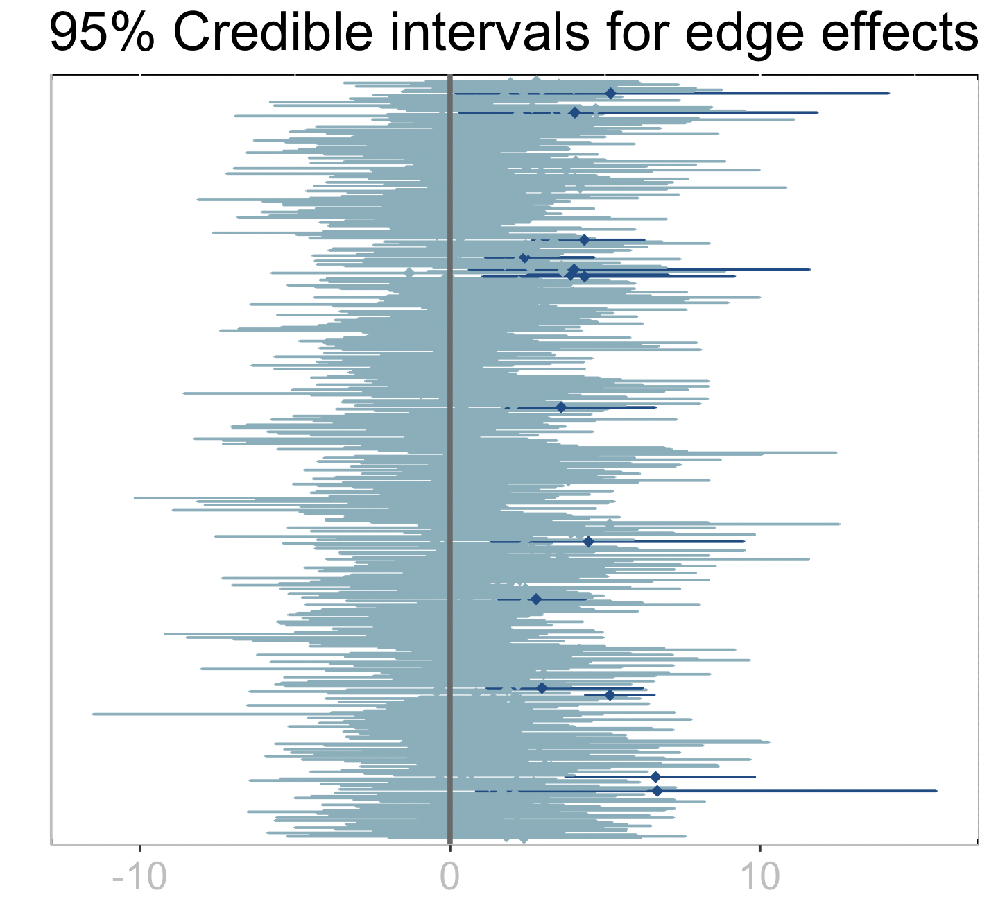
The dark credible intervals are those that do not intersect zero which point at potential edges (interactions among microbes) that have a significant effect on the response.
The following R code can be used to plot posterior probabilities of being influencial nodes (micrones) on the response.
First, we pass the data frame to R:
nodes = out.prob_nodes

@rput nodes
An alternative path is to save the data frame to file with CSV.write("nodes.csv",out.prob_nodes) and then read in R.
nodes$microbe <- 1:length(nodes$probability)

axisTextY =

## Plot:
plt2 <- ggplot(data=nodes,aes(x=microbe,y=probability)) +
    geom_bar(stat="Identity", fill="#82AFBC") + xlab("Microbes") + ylab("") +
    ggtitle("Posterior probability of influential node") +
    theme(
        plot.title = element_text(hjust=0.5, size=rel(2)),
        axis.title.x = element_text(size=rel(1.2)),
        axis.title.y = element_text(size=rel(1.9), angle=90, vjust=0.5, hjust=0.5),
        axis.text.y = element_text(colour="grey", size=rel(1.5), angle=0, hjust=.5, vjust=.5, face="plain"),
        panel.background = element_rect(fill = NA, color = "black"),
        axis.line = element_line(colour = "grey"),
        strip.text = element_text(size = rel(2))
    ) +
    geom_hline(aes(yintercept=0.5),linetype="solid",color="#696969", size=1)+
    scale_y_continuous(breaks = c(0,0.5,1),limits=c(0,1))
plt2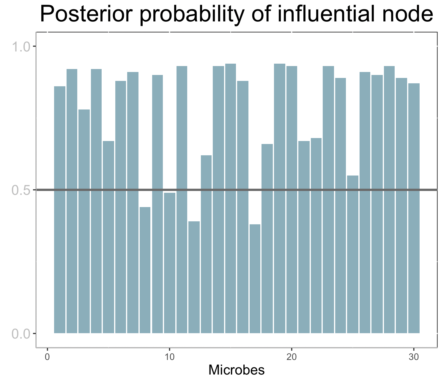
Each bar corresponds to the posterior probability of being an influential node (microbe) on the response. A horizontal line is drawn at 0.5, so that nodes with bars taller than the line can be considered influential.